Appendix A — mapgl — Sensitivity Map
A.1 Overview
The mapgl application (shiny.marinesensitivity.org/mapgl) is the primary interactive tool for exploring composite marine sensitivity scores across BOEM Program Areas. It enables users to visualize extinction risk weighted species presence at multiple spatial resolutions, with integrated flower plot and treemap summaries.
Figure A.1 shows the global view of cell-level sensitivity scores across all US waters. The sidebar provides controls for study area, spatial units (raster cells or program areas), and layer selection.
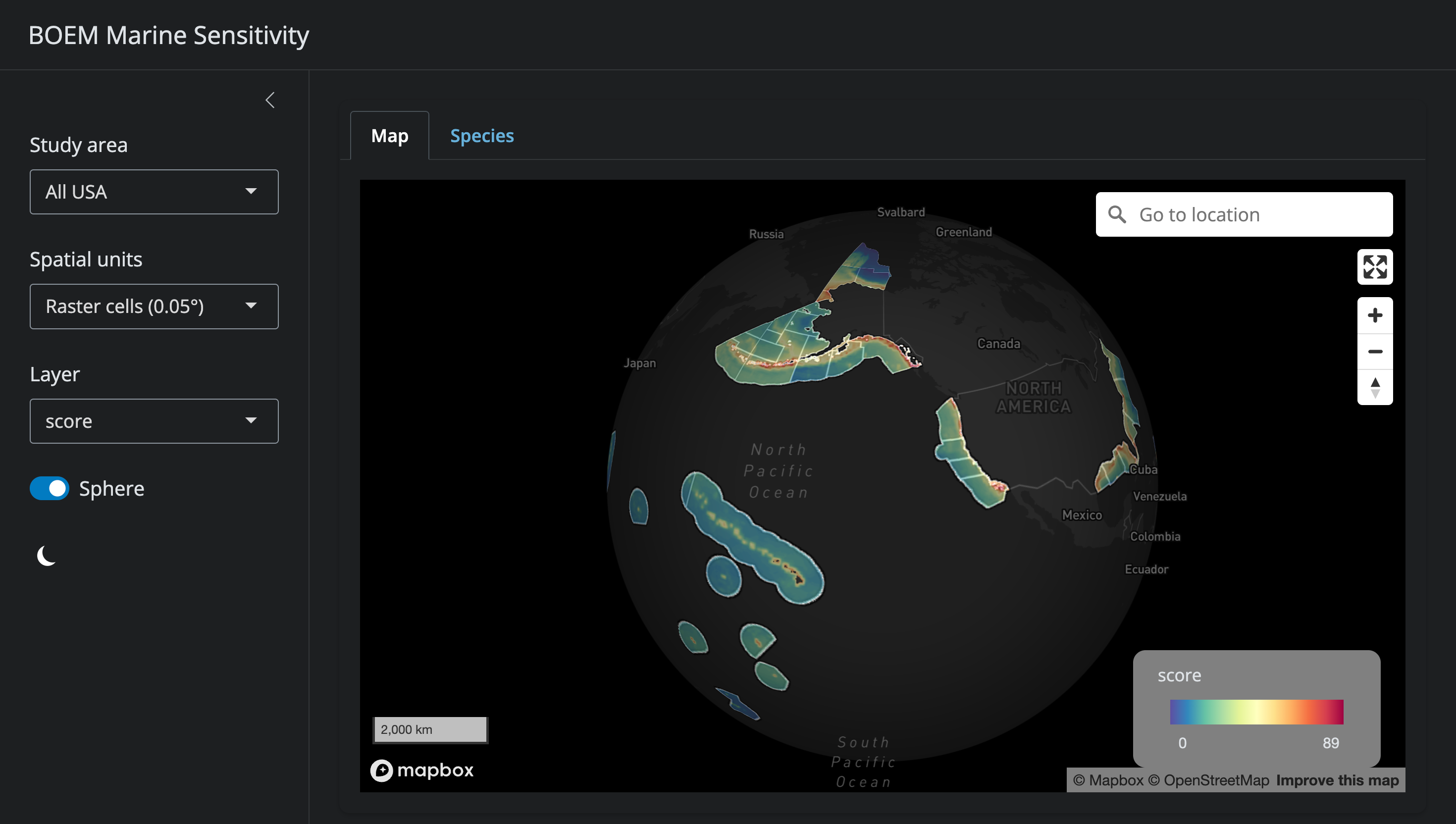
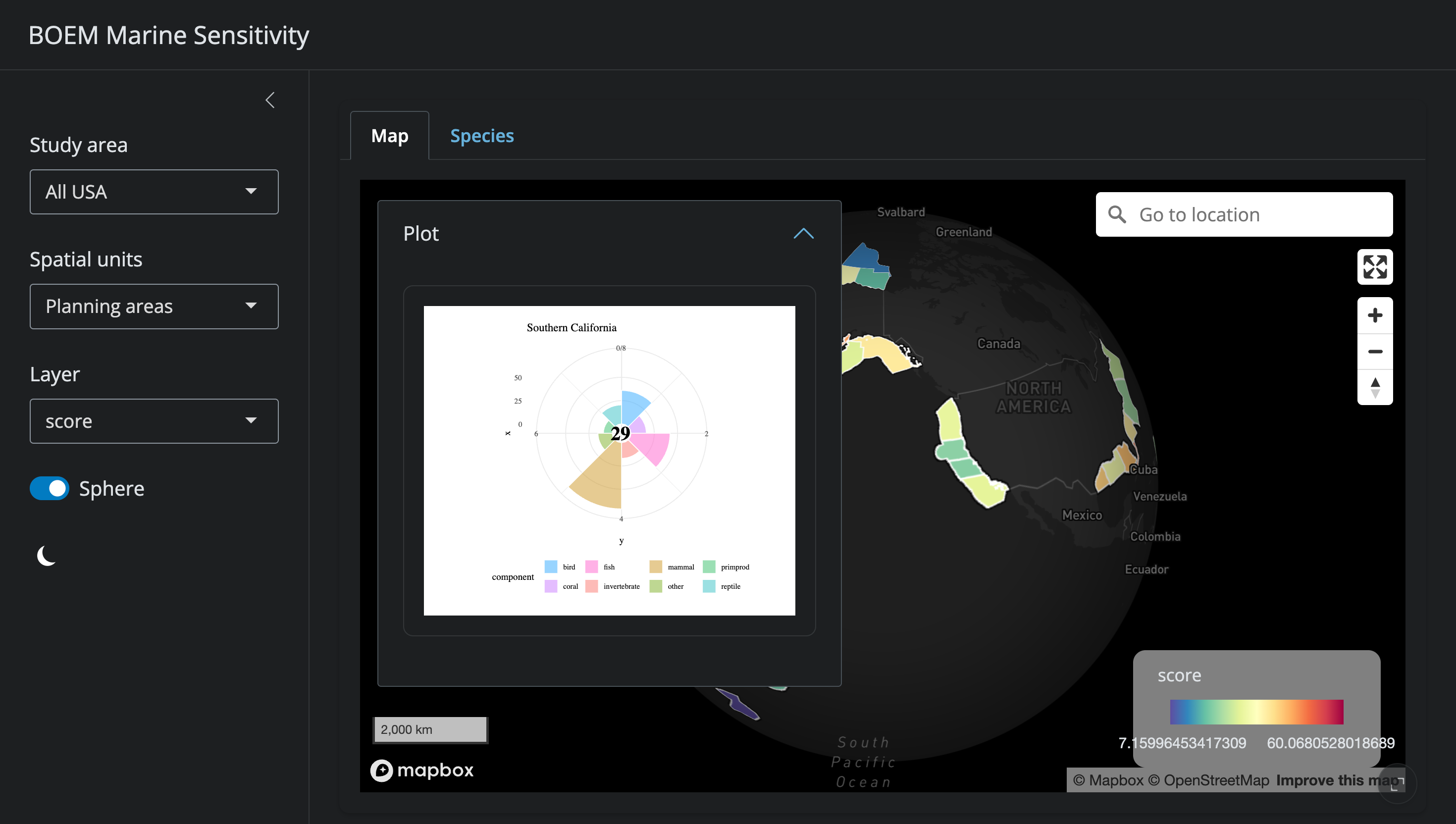
Figure A.2 shows the flower plot panel that appears when a program area is selected. Here, the Southern California program area displays a weighted mean score of 29, with petals representing species categories (bird, coral, fish, invertebrate, mammal, other, turtle) and primary productivity.
A.2 Features
A.2.1 Map Display
- Cell-level view: 0.05° grid cells colored by sensitivity score for the selected metric
- Program area view: aggregated scores by BOEM Program Area, with boundaries overlaid
- Base maps: multiple MapBox base layers (satellite, streets, light, dark)
- Study area selection: click a program area to focus the view and update summary panels
A.2.2 Sensitivity Metrics
The map can display any of the following layers:
- Composite extinction risk (weighted sum across all species categories)
- Individual category scores: bird, coral, fish, invertebrate, mammal, reptile/turtle
- Primary productivity
All scores are ecoregionally rescaled to [0–100] for meaningful cross-region comparison (see Chapter 7).
A.2.3 Flower Plot
Selecting a program area displays a flower plot summarizing the sensitivity profile:
- Each petal represents a species category
- Petal length = rescaled sensitivity score (0–100)
- Petal width = category weight
- Center value = weighted mean across categories
A.2.4 Species Table
A sortable table of all valid species present in the selected area, showing:
- Scientific and common name
- Species category
- ESA listing, IUCN Red List status
- MMPA/MBTA protection flags
- Extinction risk score
A.2.5 Data Export
Users can download CSV files of scores and species lists for the selected program area or custom area of interest.
A.3 Generating Screenshots
A.4 Source Code
The application source code is at: apps/mapgl/app.R