20 Apps User Guide
Step-by-step walkthrough of the Scores and Species applications
This guide walks through the two interactive applications — Scores (app.marinesensitivity.org/v3/scores/) and Species (app.marinesensitivity.org/v3/species/) — one control at a time. Each numbered step below mirrors a step in that app’s built-in Take a Tour (click About → Take a Tour in either app to walk the same path live), with the relevant control highlighted on the screenshot.
For a feature-by-feature reference instead, see the Scores and Species appendix pages.
The steps, captions, and highlighted screenshots are generated directly from the apps’ in-app tours (the Conductor$new()$step(...) chains in each app.R). Running libs/apps-guide-regenerate.R re-parses both tours, re-highlights the same CSS element each tour points at, and re-captures the screenshots, writing figures/apps-guide/steps.json. So whenever a tour changes, re-running that one script refreshes this whole page.
20.1 Scores app
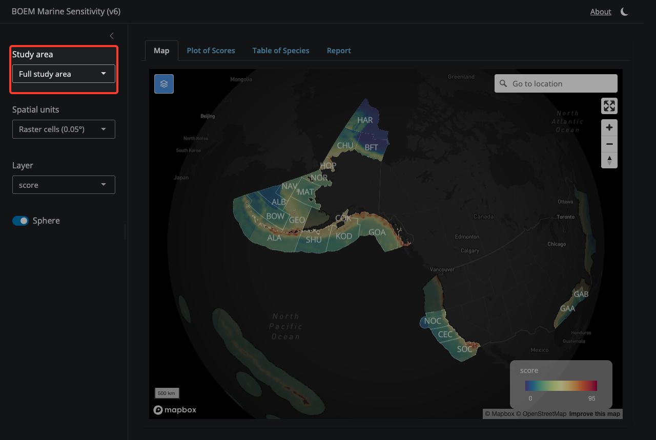
20.1.1 1. Study Area
Pick a region to focus on. ‘Full study area’ shows all US federal waters from the Aleutians to the Caribbean and out to the Pacific Island Territories. The other choices zoom into a single subregion.
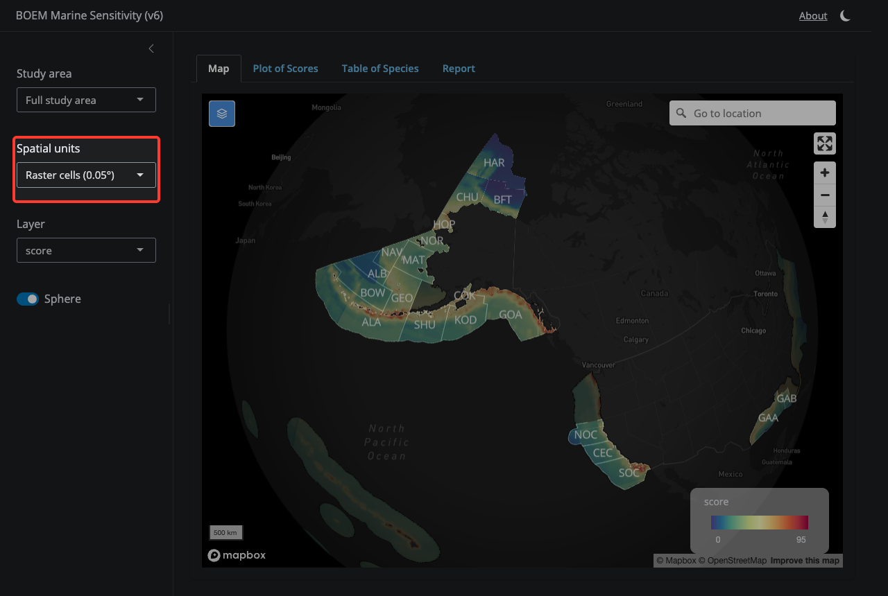
20.1.2 2. Spatial Units
Toggle between fine-grained raster cells (0.05°) and aggregated BOEM Program Area polygons. Cell mode lets you click any pixel; Program Area mode shows pre-aggregated zone scores.
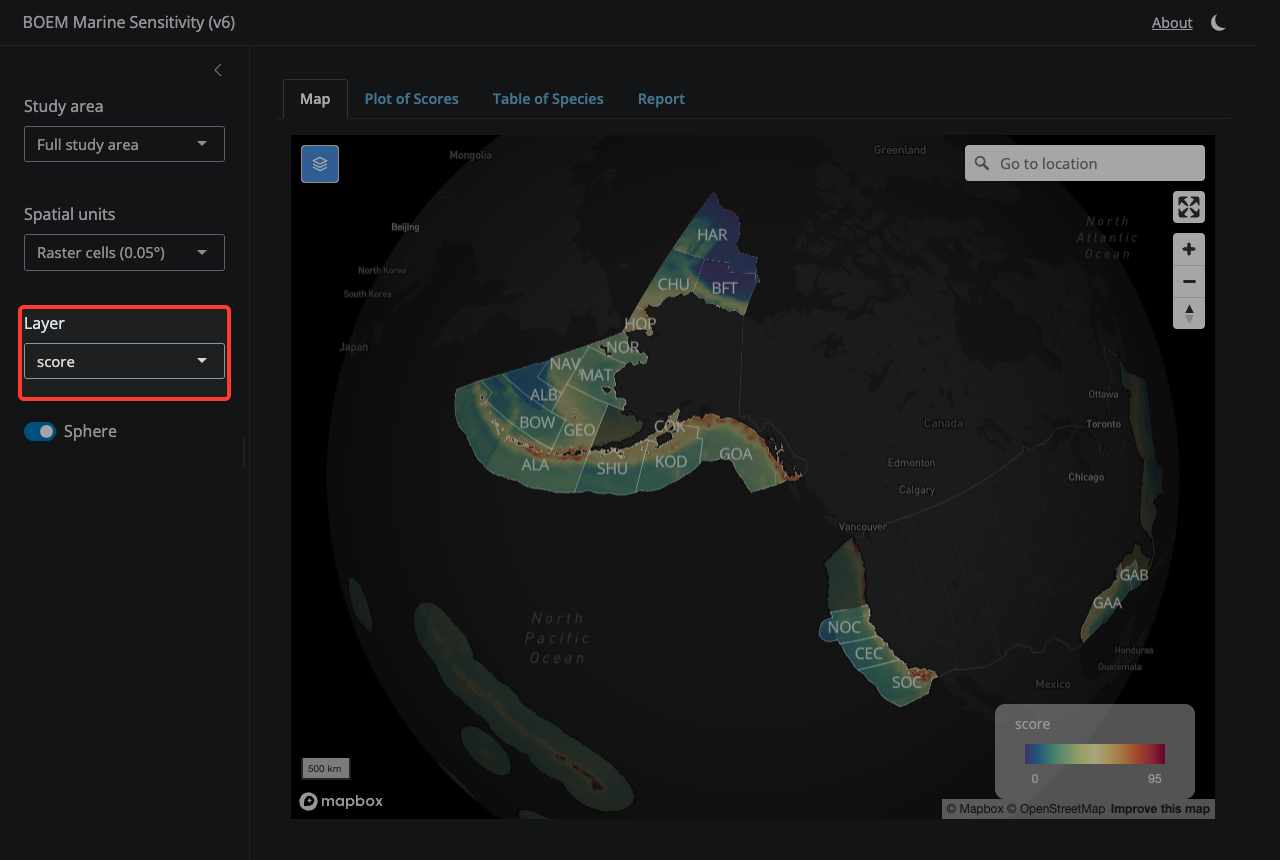
20.1.3 3. Layer Selection
Choose which sensitivity metric to display — composite score, individual species categories (bird, fish, mammal, etc.), or primary productivity. Note that some cells (Atlantic, Gulf of America, Hawaii, Puerto Rico, Pacific Islands) have scores but lie outside any v6 BOEM Program Area; they appear dimmed under a ‘Cells outside Program Areas’ overlay.
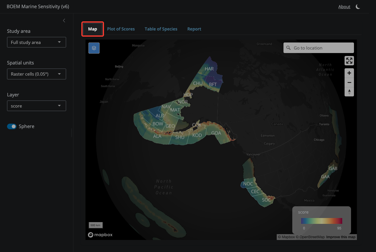
20.1.4 4. Map tab
The Map tab is where you explore scores spatially — click cells or click Program Areas to see their scores.
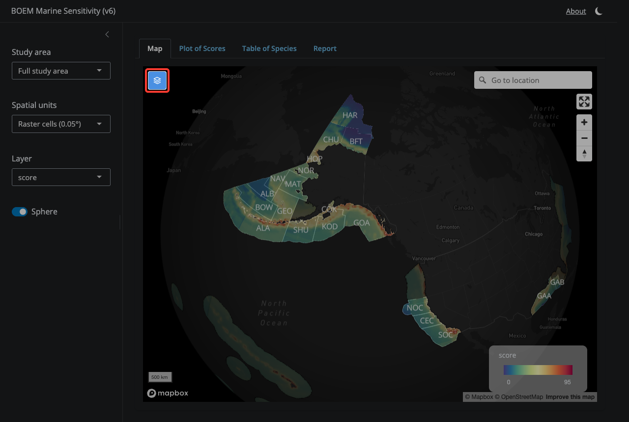
20.1.5 5. Layers control
Toggle individual map layers on and off — program area outlines, ecoregion outlines, raster cells, and the gray ‘Cells outside Program Areas’ overlay.
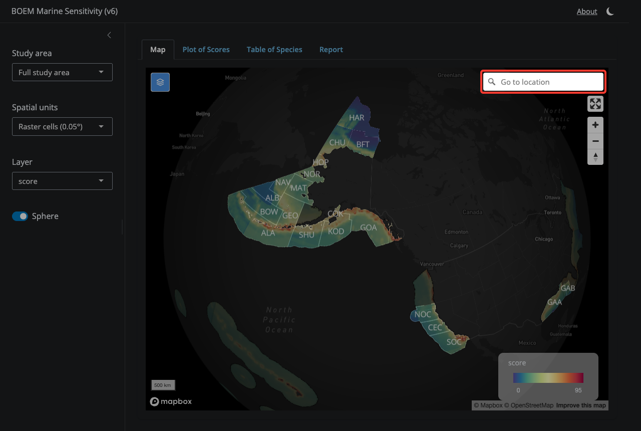
20.1.6 6. Go to location
Search for a place name and the map will fly there — useful for jumping to a specific Program Area, port, or feature.
20.1.7 7. Full screen
Expand the map to fill the entire window.
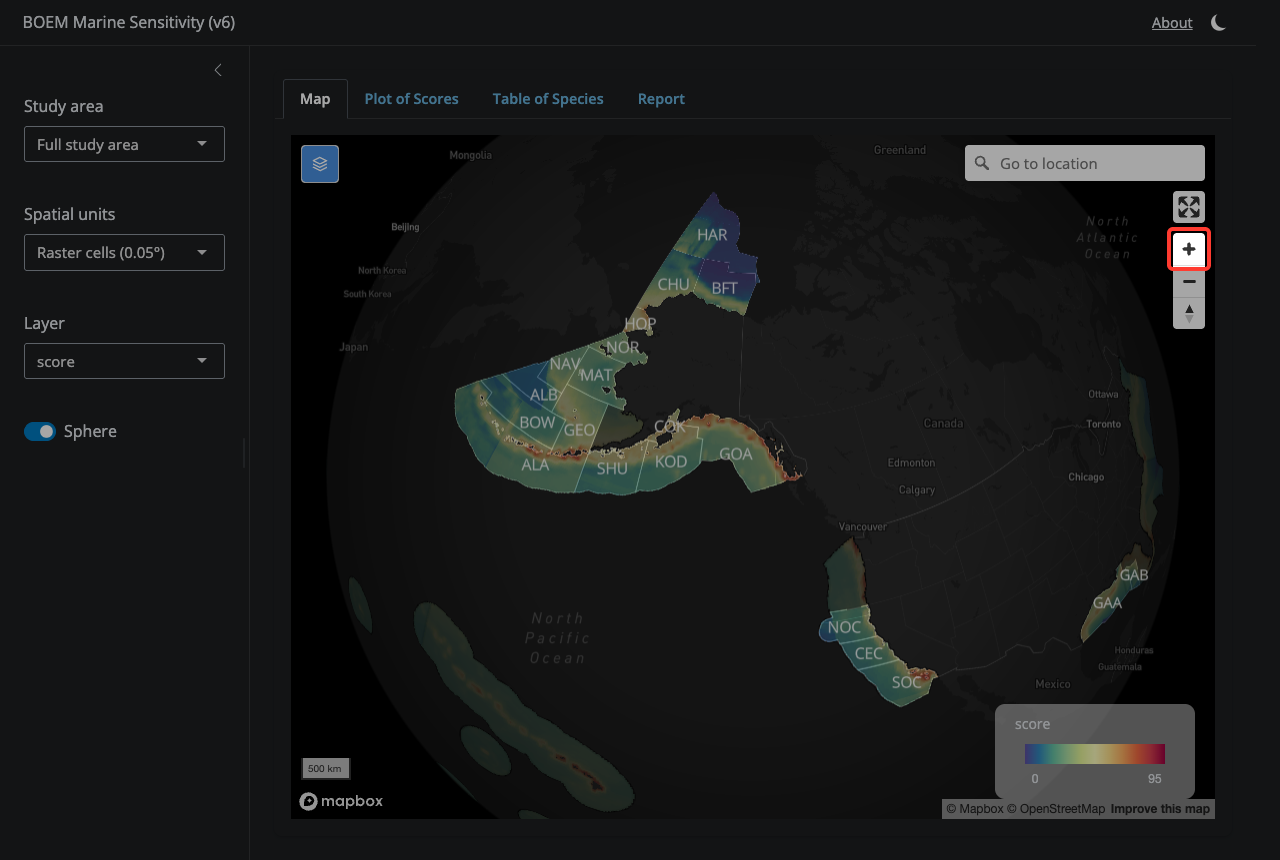
20.1.8 8. Zoom in / out
Zoom and reset the view. You can also use the mouse wheel, pinch gesture, or double-click.
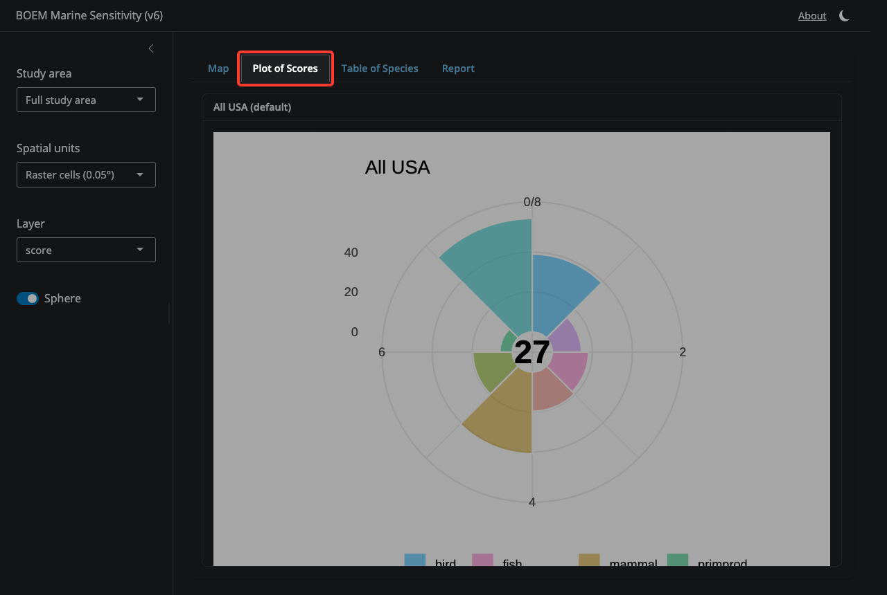
20.1.9 9. Plot of Scores tab
Switch here to see the flower plot of aggregated sensitivity scores for the current selection, broken out by species category. Petal length = score (0–100); center number = weighted mean. Defaults to ‘All USA’ until you click a cell or click a Program Area.
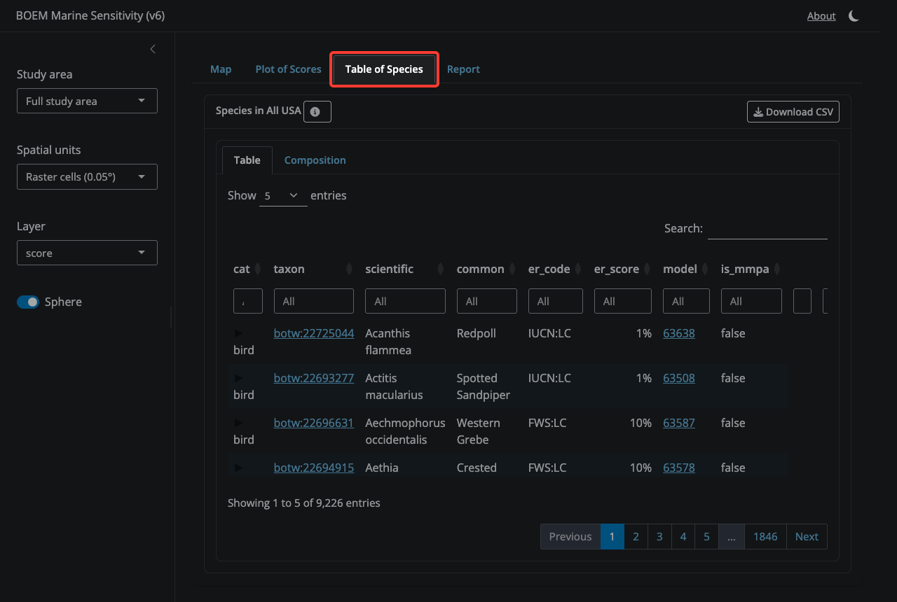
20.1.10 10. Table of Species tab
A sortable, downloadable table of every species in the currently selected area, with extinction-risk codes, areas, and per-category contributions.
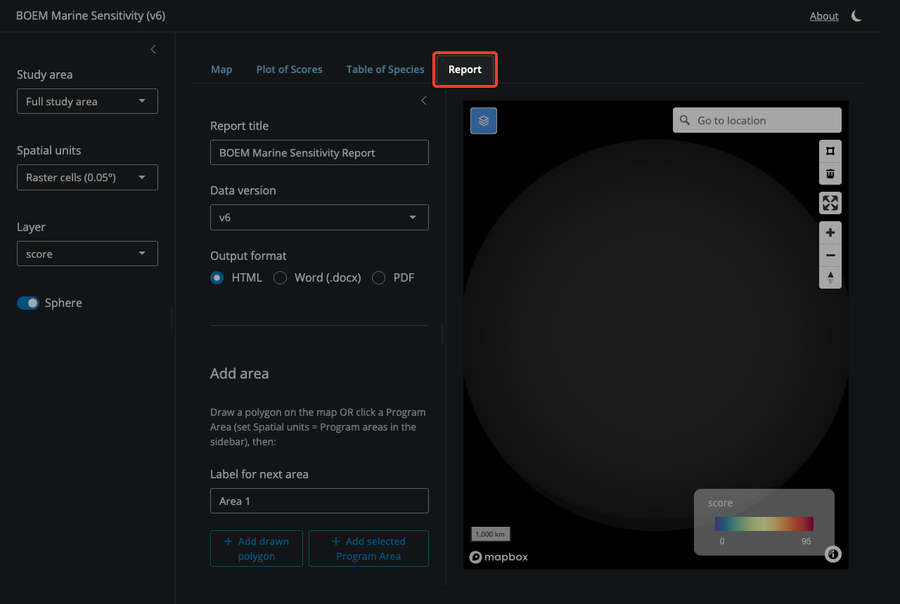
20.1.11 11. Report tab
Generate a sensitivity report for one or more custom areas. Build up a list of labeled areas by drawing a polygon on the map (using the polygon tool) and/or by selecting a Program Area, then clicking ‘Add’ for each. Set a title, data version, and output format (HTML, Word, or PDF), then click ‘Generate report’.
20.2 Species app
20.2.1 1. Select a Species
Search by common or scientific name. Results are grouped by category (bird, fish, mammal, etc.).

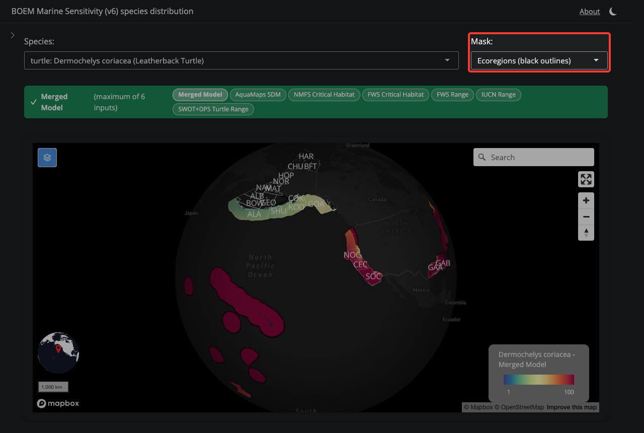
20.2.2 2. Mask Selection
Choose whether to overlay BOEM Program Area or Ecoregion boundaries on the map.
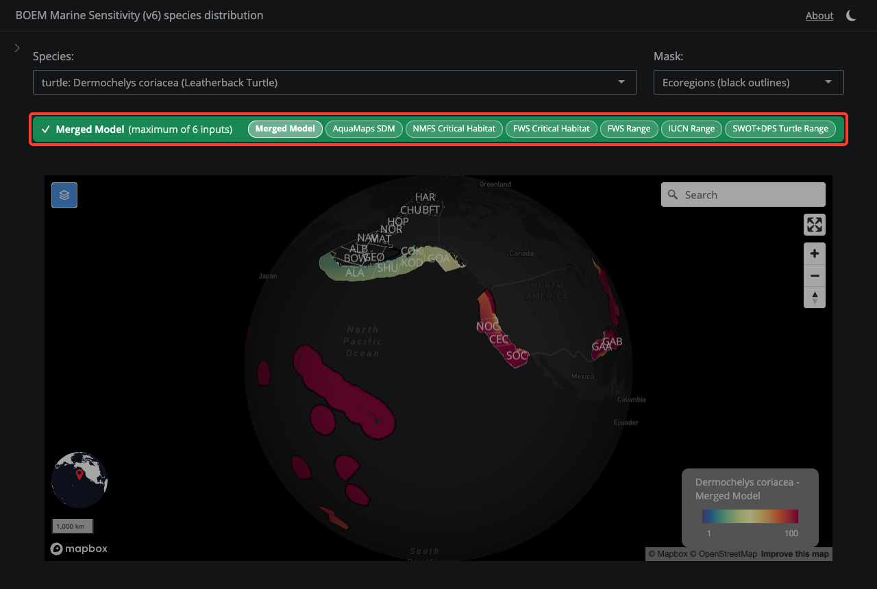
20.2.3 3. Layer Selector
The colored bar shows which model layer is displayed. Green means the final Merged Model; orange means you are viewing a single input. Click the pills to switch layers.
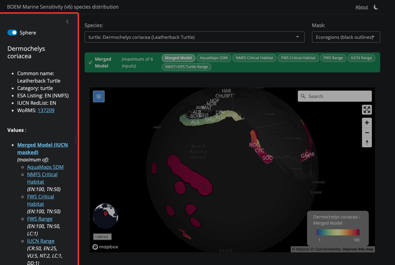
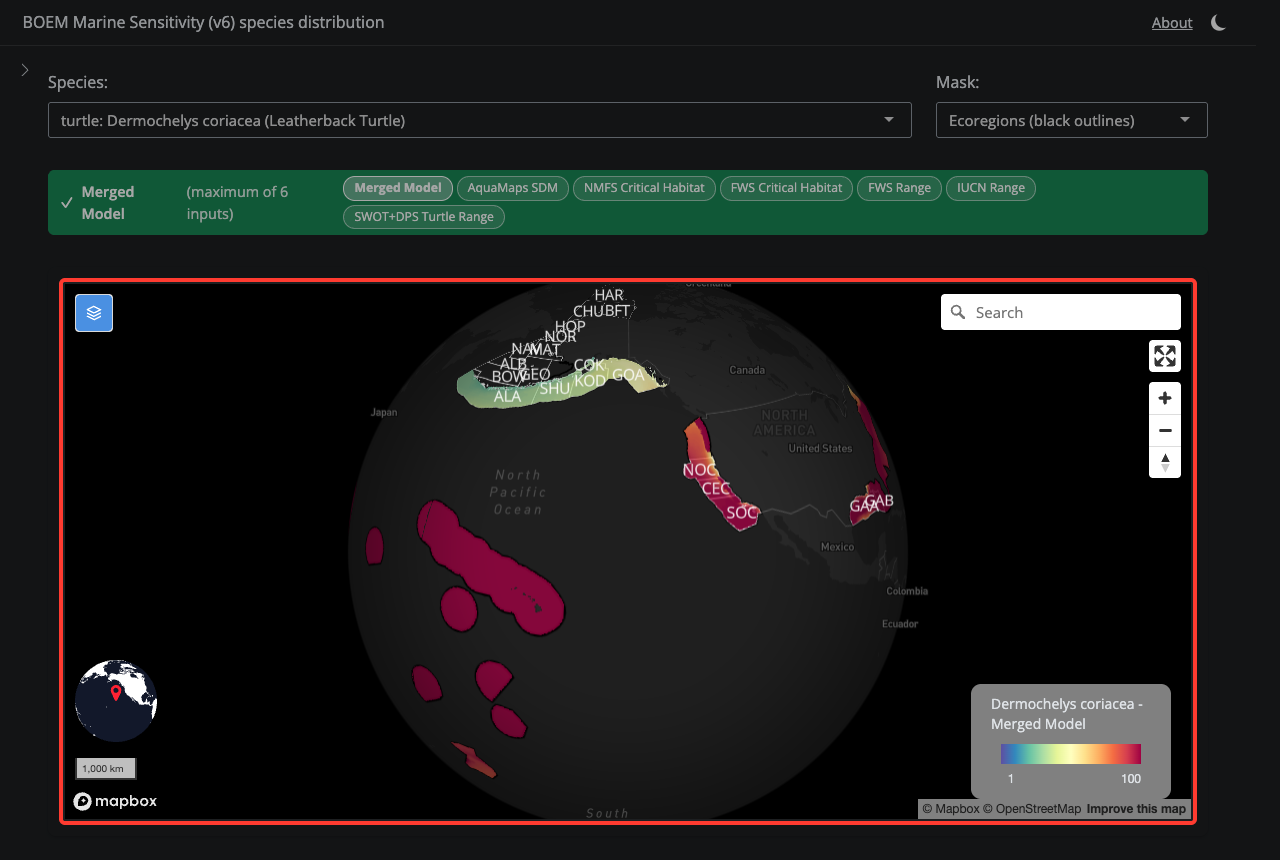
20.2.4 4. Species Map
The map shows the species distribution model. Cell values range from 1 (low sensitivity) to 100 (high sensitivity). Click cells for details.
20.2.5 5. Species Info
Open the sidebar to see ESA listing, IUCN status, MMPA/MBTA flags, and extinction risk score for the selected species.